Texture affects how light interacts with any surface. This allows a surface to become highly reflective or, inversely, to appear to absorb light which appear as a dull area on a surface. Texture can also be used to create rough areas which can mimic everything from fabric to wood grain. Texture depth can be from a fraction of a millimeter, however the subtle change in surface can create dramatic changes to a surface.
 These plastic tumblers have a various textures applied
creates an interesting design, it also affects color and is a value added feature.
The value added to a product can be substantial; a simple design such as the tumblers shown above can look more expensive with a texture design added. In mold textures are an extremely low cost alternative to a secondary process such as printing, water/heat transfers or by using in-mold films.
Common textures can be specified by using In-Mold texture specification books such as Mold Tech (in the US), Yick Sang (China) which is one of the easier to specify if working with a vendor in Asia, and Great Wall, (China) however you may find you need a longer lead-time when specifying from Geat Wall textures.
 Examples of in-mold textures available from Mold Tech
Custom textures can be specified, however you will need to work closely with a texture company, such as Mold Tech, to achieve your desired affect.
 A texture is applied to a mold which will give the surface a subtle orange peel appearance
The process of applying in mold textures is fairly straight forward and is done after the tool (part mold) is cut (created). The following steps are typical to the process:
- Laser Etching/Cutting
- Accugrave
- Electroless Nickel Teflon Mold Coating (aids in release and mold life)
- Micro-laser Etching
On the technical side, textures can improve the part by hiding parting lines, disguising sink marks and creating a greater surface area on the part. Work closely with your tooling professional to find out if a texture is needed to enhance the part or make the design more robust.
Finally, remember to use texture as you would any other surface treatment. Use a light hand when applying textures to your part - think of the overall design design of the part and make sure the texture is part of a cohesive whole.
Surface: the outer appearance of a person, thing or situation; the qualities that you see or notice, that are not hiddenThe surface of an item can be complex or simple; they include color, material, texture, finish and pattern. In product design, a surface is all of the above and encompasses the entire outer shape. They can match the aesthetic design or conversely have an opposite and wholly different aesthetic.  This is a Munny, it is one of the "soft, super smooth vinyl figures that make up MUNNYWORLD. Each one is a blank canvas, and all ready for scribbling, piercing, painting, posing, piling, dressing up, and sculpting into forms straight from your imagination." (http://sites.kidrobot.com/munnyworld/?p=about) Left unadorned, it appears cute and cuddly.
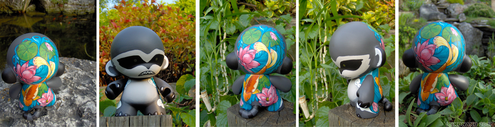
 This is the same character with a custom surface design by Konako. The character has been given a completely different personality by the artist. Still cute, however a bit threatening at the same time.(http://fc03.deviantart.com/fs17/f/2007/141/0/7/Munji_by_konako.jpg)This post will cover what appears as the most obvious to most people: Color; The appearance things have that results from the way in which they reflect light.
When light hits objects, wavelengths are absorbed or reflected, dependent on the materials in the object. The reflected wavelengths the perceives are what we refer to as the objects color. The eye contains the retina which has four types of light sensors. The rods perceive brightness and darkness (What we see as the intensity of a color). The eye also contains three types of cones, each cone absorbs a different spectrum range of visible light. One set of cones absorbs long wavelengths, the reds. Another absorbs mid-size wavelengths, the greens. The third absorbs short wavelengths, the blues. Together, these rods and cones gather the information that our brain then processes into one combined image.
According to an article from the BBC (http://news.bbc.co.uk/2/hi/health/3929071.stm), researchers at Arizona State University have discovered the gene that allows people to see red lives on the X chromosome which means women have two of these genes. So, women tend to see a broader range of red wavelengths than men. This could explain why women tend to have a greater appreciation for the color pink. However, many pinks found in the marketplace may not appeal to women due to a greater ability to discern the subtleties in red hues. When in doubt ask a range of women to check your color choice. Pepto Bismal pink does not have a huge following unless you have an upset stomach. Following are some definitions of color and how it is defined.Hue: The name we give to a distinct part of the spectrum—"red" "yellow" "purple"
Saturation: The "purity" of a color—how much Grey is or isn't in it.
Value: (or Intensity or Lightness) The "brightness" or "darkness" of a color, the amount of a brightness, light, or white in the color.
Primary: The three defining colors of a color wheel, from which all other colors are built. (Red, Blue, Yellow. In printers parlance, Cyan, Magenta and Yellow)
Secondary: The three colors created by blending two primary colors. (Green, Purple and Orange.)
Tertiary: The six colors created from the three primary and three secondary colors. (Red Purple, Blue Purple, Blue Green, Yellow Green, Yellow Orange, Red Orange.)
Complementary: Colors at opposite sides of the color wheel, high contrast with each other. These combinations can be very exciting to the human eye.
Triad: Set of three colors equidistant around the color wheel. Imagine a triangle touching each of the three colors.Analogous: Colors next to each other on the color wheel. Neighbors can be friends. Color combinations in this group can have can a calming effect.RGB: Red, Green, Blue. The primary colors in the additive model. This means that by adding one color to one of the others in this group you get a lighter color. This color model is used in computer monitors, television sets, and theater.CMYK: Cyan, Magenta, Yellow, Black. The primary colors in the printer's version of the subtractive model. Black is added to the mix for sharpness of the printed image. In a subtractive model, by adding these colors together, you end u with a darker color. If you added all of these colors together you would get a color close to black.
Their are different color systems available to define color, two of the most common are:Pantone Color Matching System (PMS)National Color Matching System (NCS) which I was exposed to more in depth at the Color Marketing Group Conference and seems to offer some interesting color matching options.
There are many color matching systems on the market and around the world from color formulators and I will will discuss some of them at a later date. Custom color can be achieved by using any of the above and you will usually own that color once it has been formulated. This can be an expensive undertaking and may not be the best bet for trend colors which last for a season then disappear. For a company color or product which will have a long shelf life it can enhance your brand experience.
Color is a complex thing, its use can affect emotion, energy level, evoke memories, and enhance mood and learning. It gives clues to users: red = stop, hot, danger. It can soften shapes or create excitement for a product. Color can become a signature; Swiss army red, Facebook blue. Color can be the first conversation you have with your consumer, the idea here is to choose well and get the conversation started.
 These plastic tumblers have a various textures applied
 Examples of in-mold textures available from Mold Tech
 A texture is applied to a mold which will give the surface a subtle orange peel appearance
